Hold Tight Sew Along Week #1

Welcome to Week #1 of the Hold Tight Sew Along! For this blog post, and the following three posts, I'll be share tips and tutorials to bring your quilting skills to a new level. No longer will curved piecing hold you back from stitching a quilt with curves!
If you don't have the pattern already, you'll want to purchase the Hold Tight PDF pattern from my Shop page or from our friends at Fat Quarter Shop who now carries this pattern as well as Hold Tight quilt kits. Please note that the kits from FQS will be ready to ship at or around March 23rd. Use the “Notify Me” function on the kit page to get updates on your order’s shipping date. These blog posts serve to supplement the instructions but don't provide the detailed pattern information that you'll find in the PDF available for purchase. The Hold Tight pattern will have your material list, cutting requirements, full-size templates, and be fully illustrated. My supplementary blog posts are just that, supplementary and meant to guide you along as you sew.
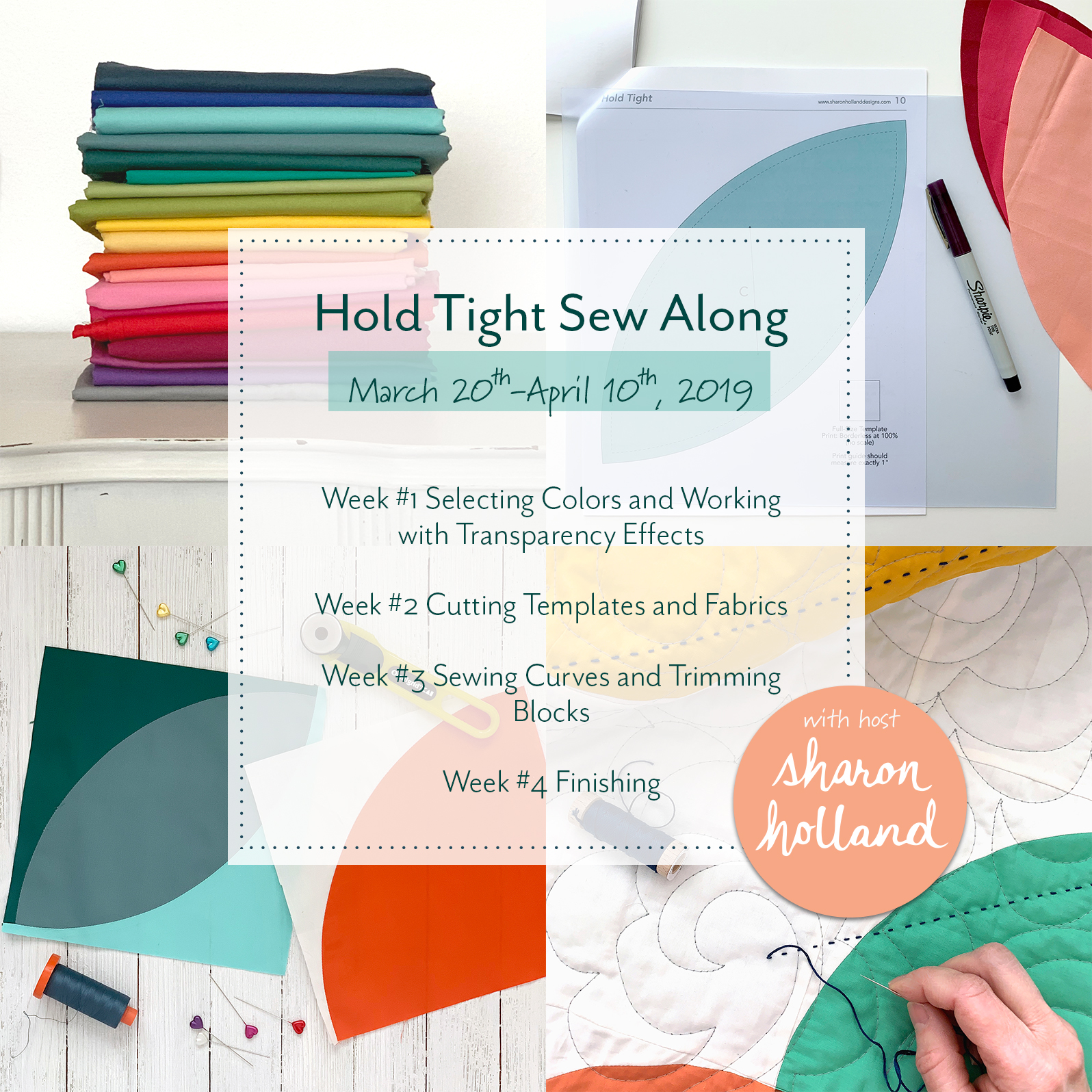
From now until April 10, 2019 I'll be breaking down the key components of the Hold Tight baby quilt pattern into four manageable tutorial blog posts. These tutorials will be useful to anyone working with fabric and patchwork regardless what quilt is being made. In addition to my written posts, I’ve adding skill-building demonstration videos to further your learning experience. The videos support Weeks #1 through #3 and you’ll find these helpful videos on my Sew Along page. All the videos will be available on Week #1 of the sew along for those wanting to work ahead and will stay a permanent feature to resource in the future.
Color and Transparency Effects
As outlined in last weeks blog post, Hold Tight Sew Along, I'll be covering a new topic each week. This week's lesson is all about selecting colors and working with transparency effects.
Color is a big subject, but I'll attempt to give you a practical and applicable approach to color as it pertains to selecting fabrics for this quilt.
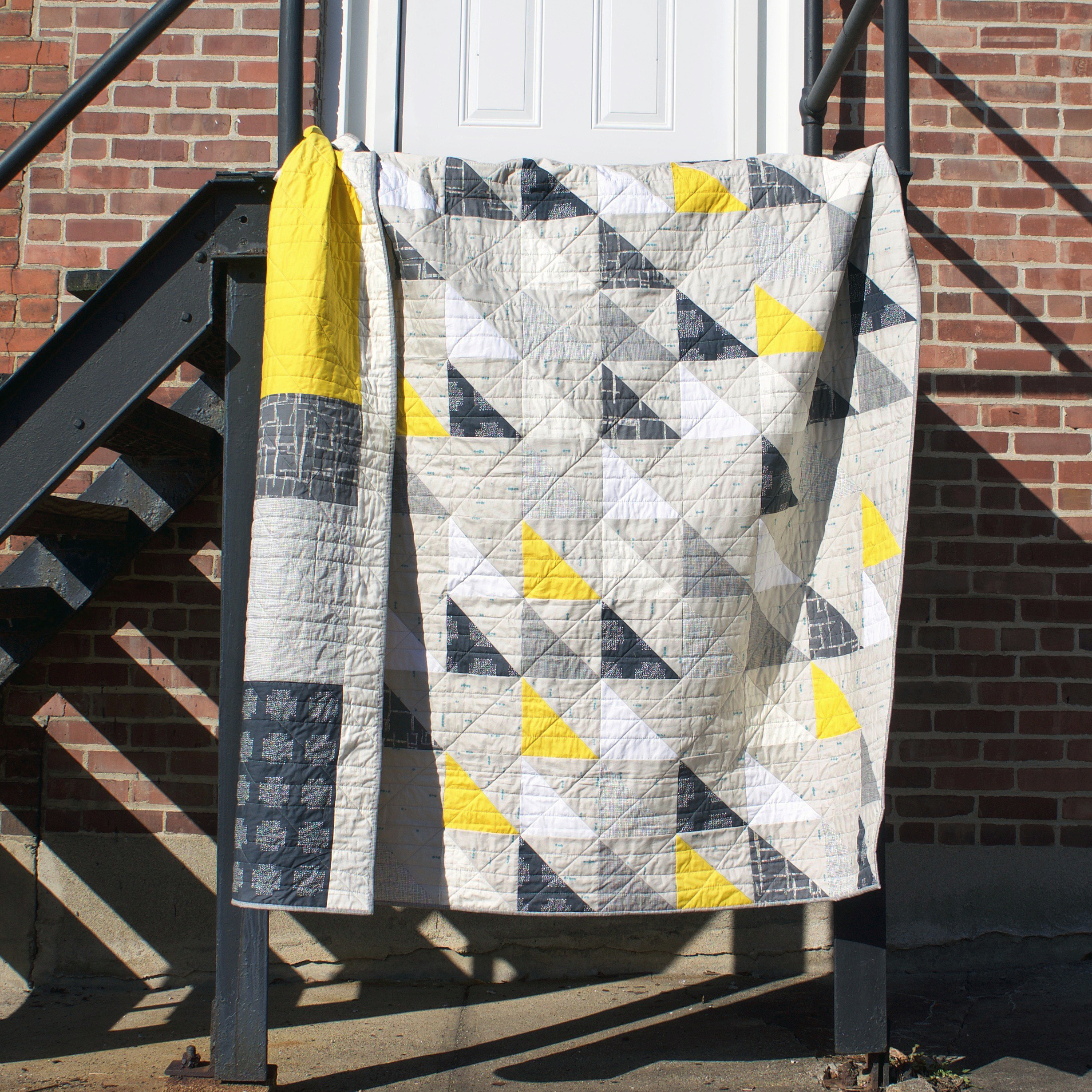
Since color is the first thing anyone notices in a quilt—even before the design, we need an entire post just on this subject. The Hold Tight baby quilt offers plenty of opportunity to play with color through the graphic shape of a balloon. But where do you begin when you must decide on a maximum of 20 different solids!!!???

This quilt is marketed as a baby quilt but its large size also makes it suitable as a throw-size quilt for any age. Maybe there's already a nursery color scheme selected, favorite colors, or some sort of predetermined color inspiration (like from printed fabric or artwork). That's really helpful and gets you halfway to a fabric pull. If you'd like to create a color palette from creating a mood board, take a look back at the Community Sampler Week #1 post on this blog. If you remember, I made my Community Sampler quilt using Art Gallery Fabrics Pure Solids and my color inspiration came from creating a mood board from images I found on Pinterest. But, if selecting a color palette still seems daunting, read on.

As a textile designer, artist, and newbie to embroidery coming up with color palettes and selecting just the right color for a given project is an ongoing challenge. Rather than focusing just on color relationships and schemes like you'd find on a color wheel (e.g. Complementary, Split Complementary, Diad, Triad, and Tetrad), I'll walk you through color composition instead and how to select hues that work in unity together because of their shade, tint, and/or tone. Once you've discovered how to view a color by what colors it's made from you can always go back and incorporate traditional color wheel schemes into your fabric selection process.
When you start seeing beyond the colors within a given color (hue) you'll be able to successfully mix colors physically like with paint for example or visually, like with fabric transparency effects.
In this tutorial I'll be using the following technical terms:
Shade: Amount of black added to the hue
Tint: Amount of white added to the hue
Tone: Amount of gray added to the hue
Value: Lightness or darkness
Intensity: Brightness or dullness
Before I tackle mixing colors, let's first discuss the easiest way to select colors that achieve the effect of unity and transparency by using a Monochromatic color scheme. For both the Hold Tight pattern sample and the quilt you'll see featured in the sew along tutorials I'm using a combination of monochromatic color trans effects and mixed color transparency effects and sewing with Art Gallery Fabrics Pure Solids fabrics.

A Monochromatic color scheme uses one color and the shades and tints of that color. Art Gallery Fabrics has an array of shades and tints available for their Pure Solids and makes it easy to achieve beautiful gradation steps of colors—creating a transparency effect where the balloons overlap.
The four monochromatic color schemes above illustrate color steps arranged from tints (lightest) to shades (darkest) of a hue.

To illustrate mixing colors I'm going to refer back to the color wheel and start with the Primary Colors which are blue, red, and yellow. These three colors cannot be created by mixing other colors.
If you mix equal parts blue and red you'll get violet (or also referred to as purple). Mixing red and yellow will create orange and mixing yellow and blue will result in green. These resulting colors are called Secondary Colors because they were made from mixing two different Primary Colors.
Tertiary Colors are the result of mixing a Primary Color with a Secondary Color. The resulting color name always has the primary color first followed by the secondary color. For example: blue-green, red-violet, red-orange, yellow-orange, and yellow-green.
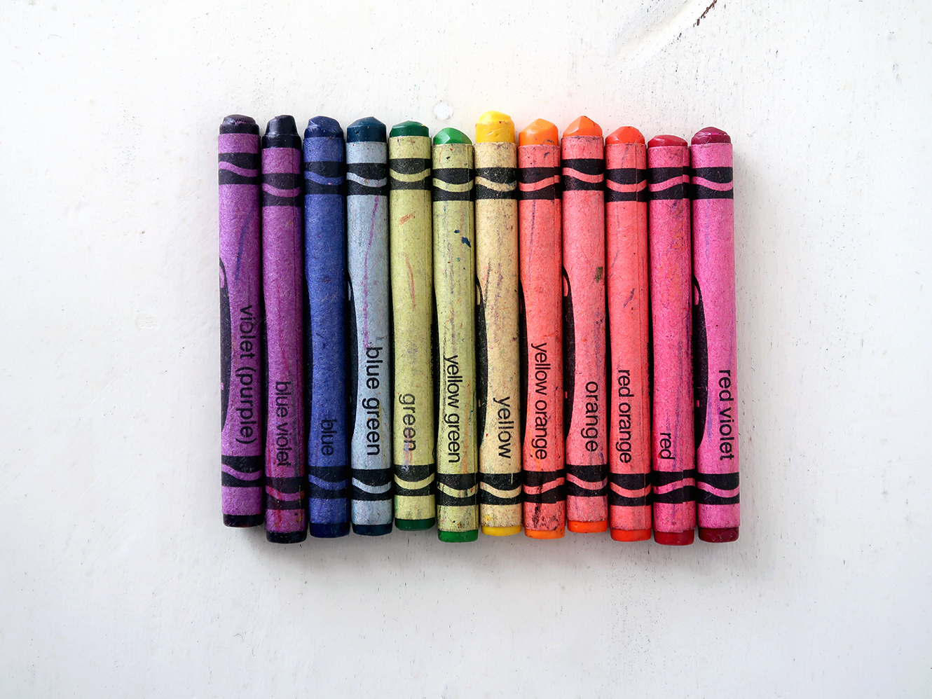
Crayola Color Wheel
As a kid I was fascinated by color and as soon as I could read I was memorizing the names of the crayons. From early on I saw the pattern of this primary color name first followed by secondary color name as a way to distinguish one color from another.

Anyone who's gone to the hardware store to buy a can of white paint knows about the zillions of options there are for “white” paint. Do you want a yellow-white, a pink-white (which has a whisper of red paint added to the can), a cool, blue-white, a white with a warm, green cast...??? You get the idea. Once you understand about Primary, Secondary, and Tertiary Colors you can start to see what makes up a particular hue.

I'm remaking a Hold Tight quilt for this sew along to put myself in your shoes of where to start for selecting colors. I had no color scheme in mind, so I got out my watercolor paints. If you don't have watercolors then attempt the same exercise with colored pencils, acrylics, pastels, crayons, markers, colored tissue paper that can be overlapped, or anything that can be mixed, blended, or overlaid and put onto paper for this lesson.
Begin with mixing Primary Colors to make violet, green, and yellow. Try to get as close of a match to a true Secondary hue as possible just to give yourself a clean and bright color sample (see Intensity definition). Next, create your Tertiary Colors. This is your starting point.
Start mixing colors and see what you end up with. I guarantee you'll create a lot of stuff you're pretty meh about but what's happening is you're learning about color and what colors go into to making a new color.
Now it's time to add black to your colors to create shades and darken a hue. A fun outcome of adding black to yellow is you'll create a drab olive green. True story: I never use a pre-mixed black paint when painting. I always create some sort of near-black from the colors already used in the art.
Next, add white to make tints and lighten a hue.
For some real fun try mixing colors that are directly across from each other on the color wheel (e.g. Complementary Colors). The results can vary from creating different brown hues to different gray tones depending on what colors make up the resulting hue.

After this exercise about shades, tints, and tones you'll start to notice how adding black, white, or a Complimentary Color has changed the original color's intensity and value. Intensity and value play a big part in relative contrast and why some colors appear dull and other bright. Using fabrics of the same relative intensity but of varying values is a good rule of thumb to give the overall effect of unity. All bright colors look less bright when placed in the same quilt or piece of art. Likewise if the palette is all muted or duller those colors make sense together because of the relative sameness. Now that's not a hard and fast rule, just an example. Many times in art, mixing intensities of colors can create a focal point where the bright, pure color stands out above the more muted tones. Artists often use colors of different intensities, temperatures (cool or warm), and values to make objects advance or recede in a painting.
Contrast is very similar to Intensity and describes the amount of difference between two or more colors. We know as quilters that contrast plays a big part in how a block reads or a quilt pops. If there’s little or no contrast between touching colors (or prints) then the overall effect is very flat and at a distance may read as one solid mass.

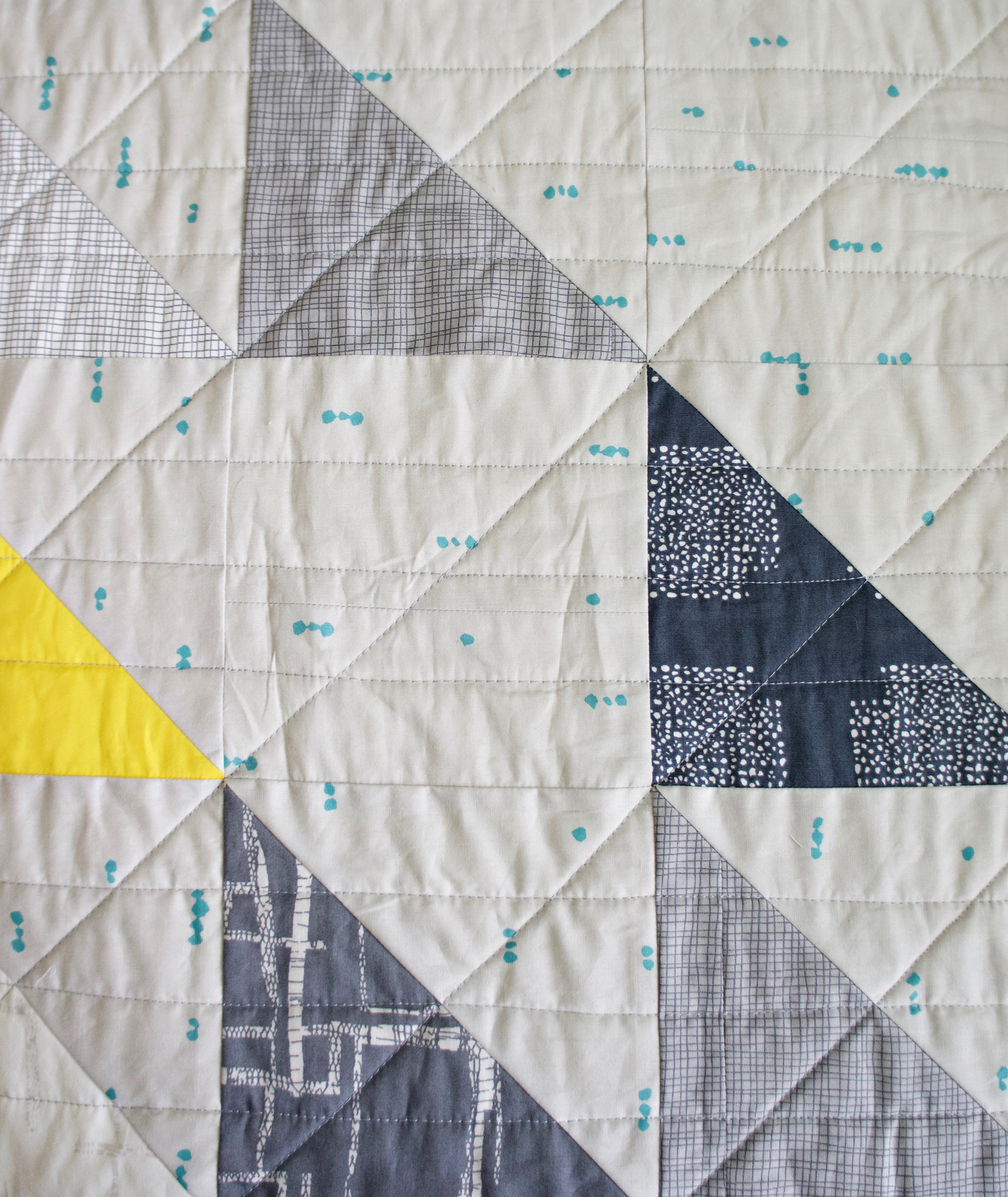
A great way to make a transparency areas successful is to utilize dark, medium, and light contrasting colors. Dark, medium, and light contrasts can be positioned in any order but I’ve found when a dark color is used on a balloon and a light colored balloon is overlapping it, using a medium (mixed result) color in the transparency area will be most affective for creating a transparency illusion. See the photo below at the transparency overlapping blocks.

Take a look at the colors you mixed and hopefully, there's some colors and blending that really speaks to you! For my quilt(s) I'm using Art Gallery Fabrics Pure Solids. Pull out all your solid fabrics or take your paper swatches to your fabric store for reference when purchasing fabrics. You may want to cut out the paint or mixed samples you want to work with. Assign the colors and color combinations you love a fabric that matches as close as possible. Don't feel you need to follow your mixed samples exactly and depending upon your available fabric colors you may need to make adjustments. Implement what you've learned in this mixing exercise and soon you'll be able to confidently make judgements about color mixing in your minds eye. Remember to look closely at the underlying colors that make up the color of the fabrics and select the transparency fabric color that would simulate as closely as possible the “mixed” result if you could mix the fabrics on either side of the transparency shape. Notice in the Monochromatic color scheme examples I’d grouped the colors by yellow-greens, greens, blue-greens, and aquas.
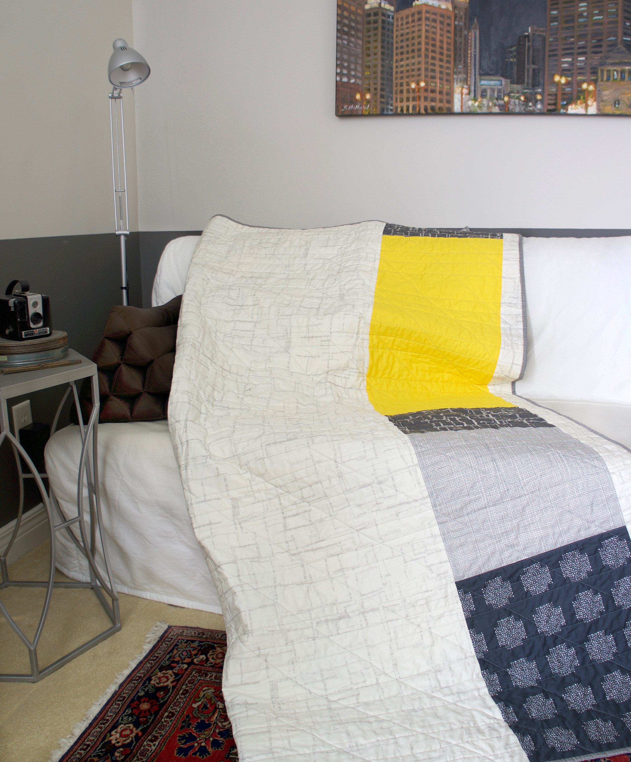
I’m calling my second Hold Tight quilt the Art Class Color Story because the above photo was the AGF color palette I came up with after my paint mixing exercise. Because I still need some print in my life I like adding a fun printed backing to an all solid quilt top. The Sporangia Plaid print from my Art Gallery Fabrics Signature collection was perfect!
The Art Class Color Story quilt uses PE-408 as the background and PE-402, PE-405, PE-410, PE-414, PE-427, PE-450, and PE-466 as the transparency fabrics.
If you have a design wall, pin up some swatches and take a step back. Squint your eyes and see if the colors make sense together. Likewise, taking a photograph of the fabric pull and viewing the photo on a screen can sometimes allow you to see color relationships you didn't notice in person.
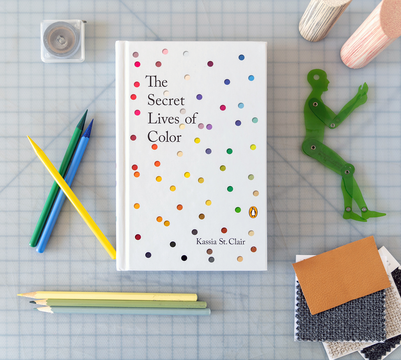
If you’d like a fun read about fascinating and unknown histories of color, add The Secret Lives of Color to your library. Awarded NPR Best Books of 2017. (Amazon Affiliate link).
My fellow Art Gallery Fabrics Designers, Dana Willard, Mathew Boudreaux, and Alexandra Bordallo along with AGF Sewcialite Carolina Moore will also be sewing along with us and making a Hold Tight quilt. I’m excited to see the beautiful colors and looks all of you will make so don’t forget to snap some pretty pictures of your color lesson homework, fabric selection, or color palette process to share with the other Hold Tight Sew Along makers. If posting to Instagram or other social platforms be sure to use the hashtag #holdtightsewalong and tag me @sharonhollanddesigns so I see your beautiful work.
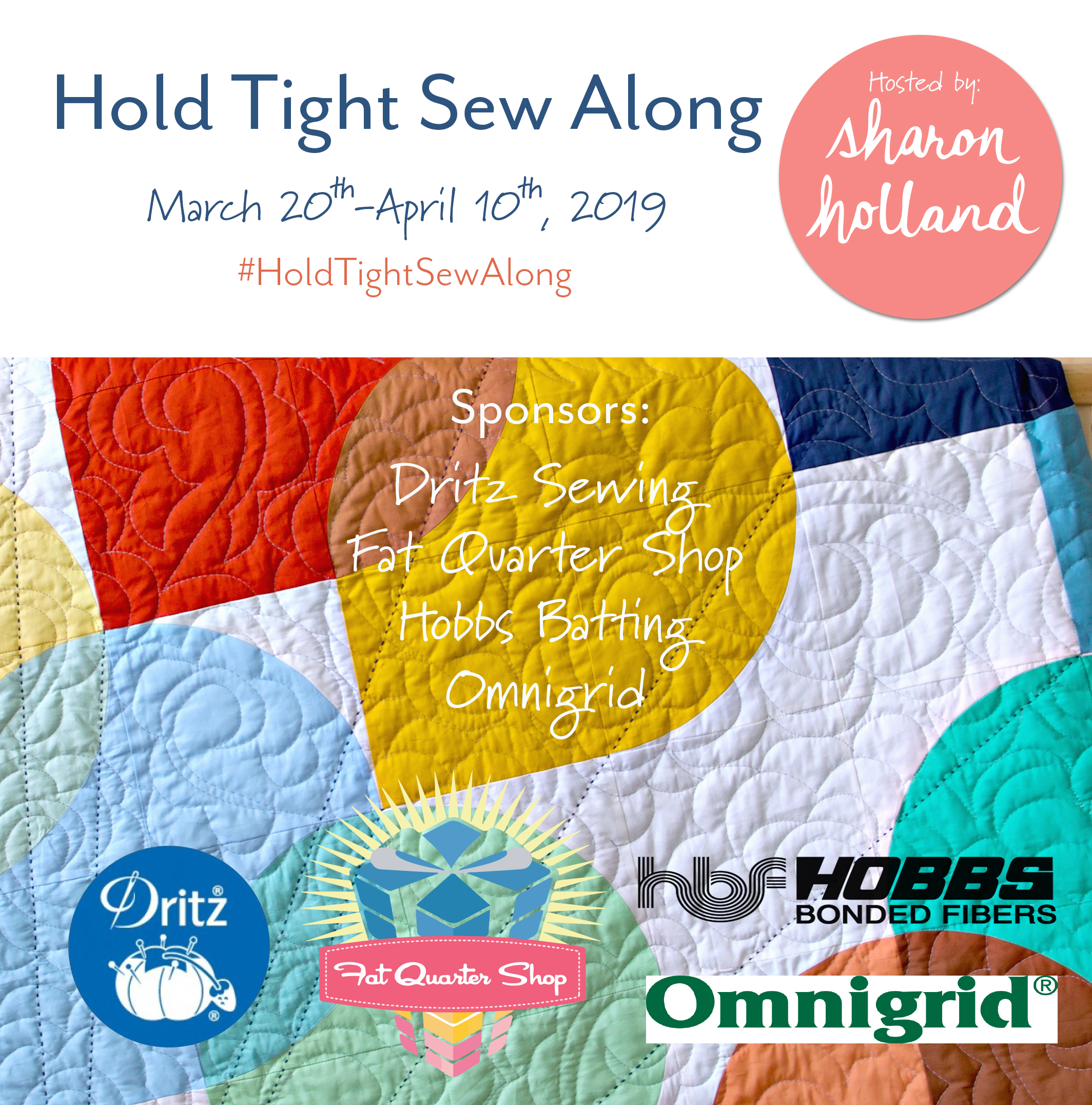
A sew along is a lot more fun with sponsors and giveaways, right!? Our friends at Dritz Sewing, the Fat Quarter Shop, Hobbs Batting, and Omnigrid have generously provided the Hold Tight Sew Along with products I know you’ll love! Every Friday, beginning on March 22nd through April 12th, 2019 I’ll be posting weekly a giveaway on Instagram. By using the hashtag #HoldTightSewAlong on Instagram every time you post sew along photos to a public account (private account posts don’t show up in hashtag pools) your IG account is automatically entered into the weekly sew along drawings! Ideas for what to share include your sew along progress, the “I’m a maker” sew along badge found HERE, your fabric pull, blocks, and finished quilt. Be sure to follow me on Instagram @sharonhollanddesigns so you never miss a thing!

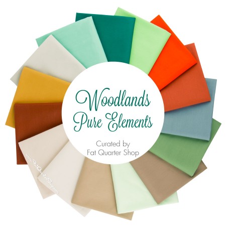
Fat Quarter Shop - Woodlands Pure Elements Fat Quarter Bundle

Fat Quarter Shop - Woodlands Pure Elements Fat Quarter Bundle
This Friday, March 22, 2019 the giveaway prize will be the beautiful 15-piece Art Gallery Fabrics Woodland Pure Elements fat quarter bundle generously offered by the Fat Quarter Shop.
Don't forget the giveaways for this sew along are held on Instagram (not on the blog) and winning names are randomly drawn from the posts in the hashtag pool. By posting images of your Hold Tight color inspiration, fabric pull, blocks, or quilt. Use the official #holdtightsewalong hashtag every time you post your makes (to a public account) and you're automatically entered into the weekly IG drawings! See my Instagram Friday giveaway posts @sharonhollanddesigns for full details.