Community Sampler Week #1

Community Sampler Week #1

CS Promo banner 2.jpg

Today is the official start of the Community Sampler! My dear friend and Art Gallery Fabrics designer sister Maureen Cracknell and I will be co-hosting this 16-week sew along. You may remember the Sewcial Bee Sampler event we hosted last year? You can still access all the PDFs. tips, and tutorial blog posts from last years block-of-the-week sew along. Begin your adventure with the first post, Start of Something Sewcial. Many of the tips and techniques we used in the 2017 sampler will be used again for this years new sampler plus there will be some new skills to add to your growing quilt repertoire.

Week #1.jpg

Your first PDF download will be the Introduction packet. In it you'll get an overview of what to expect over the next 16 weeks (that period includes this week), a full material list, and coloring book pages so you can start planning your quilt. You'll also be getting your first look at the quilt layout. Today's post will focus on how I chose my color palette for my sampler quilt. Hopefully you'll get inspired and it will help you when you gather your supplies for next week's block release. 

Download the free Introduction PDF from my Sew Along page. To keep the Instruction download a small file size and your printing to a minimum I have left the pretty cover page off of the Introduction PDF. If you'd like to include and print out our cover, click on the image below and then you can add it to your PDF. 

Fabric Selection

Pure Elements by Art Gallery Fabrics

Pure Elements by Art Gallery Fabrics

Today's post will talk about how to get started pulling your fabrics for your sampler. With so many beautiful fabric options available it's hard to know where to begin. In the Introduction PDF I suggest you focus on pulling 5 light fabrics, 5 medium fabrics, and 5 dark fabrics to make up your total yardage needed for blocks. You can adjust and sculpt the selection as you begin sewing blocks but it's good to have a basic understanding of what fabric you'll be using from the start. Here's my process for this year's sampler quilt...

CS Layered Sharon.jpg

This year I gave myself the challenge to work in only solids for my sampler quilt. Now, that may not sound like much of a challenge to some of you but don't forget, I'm a pattern designer and it's my passion to work with prints! I've only made 3 other quilts--EVER--that were all solids. That's 3 out of hundreds so this is a challenge for me. But, disclaimer here, once my new fabric line for Art Gallery Fabrics shows up around April-May of this year, you better believe I'll be making a second quilt! I am anxious to start sewing with my new collection and it will be fun for me to make a print version of this quilt, too.

Sometimes it's hard to know where to begin when choosing fabrics for a quilt. So, to get over that hump of what colors to use, I turned to Pinterest for help. You can follow me there at ShareDesigns where I've started a Community Sampler board. For my solids inspiration, I used the beautiful images found on Pinterest to help me pick a color story. Here's the mood board I put together for color selection.

Collage by Sharon Holland of images pulled from Pinterest

Collage by Sharon Holland of images pulled from Pinterest

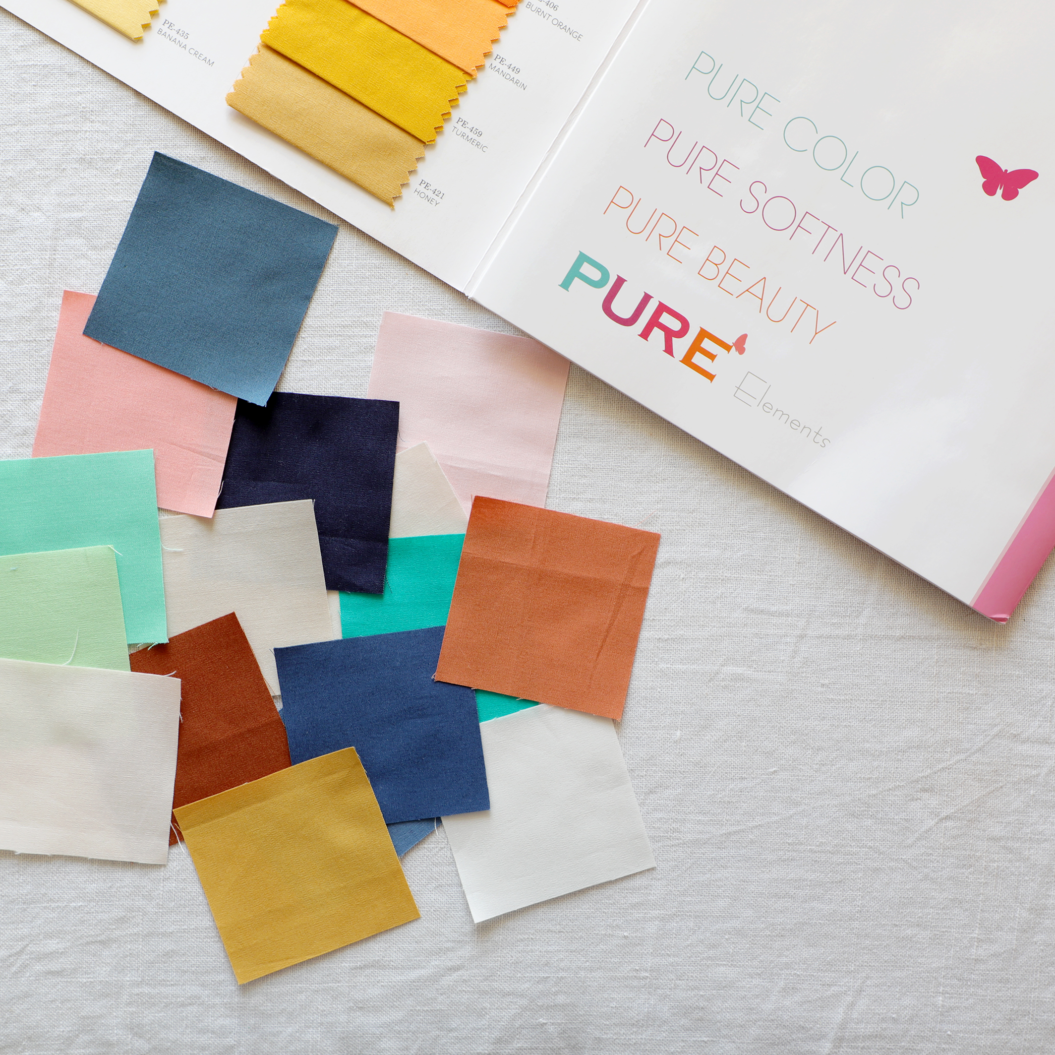
I tried not to over think things but also wanted to be receptive to incorporate new colors I wouldn't normally use. I just chose a palette that spoke to me and gave me enough colors to play with in a quilt without being overwhelming. Really, my color palette in the mood board appears rather limited but instead of selecting a ton of different colors I decided to gain variety and unity by expanding each color further with shades and tints of that color. Luckily, Art Gallery Fabrics has a wide range of gorgeous solids to choose from. I picked the core colors then added in tints and shades to build this 16-color fabric pull. Here's the result: Blush pink, peach, coral, copper, chocolate, kelly green, mint, jade, denim, navy, teal, honey, white, off-white, and cream. All these glorious solids are Art Gallery Fabrics Pure Elements (which feels like percale, btw) and below are the sku numbers of the exact palette I will be using. 

Pure Elements solids from Art Gallery Fabrics

Pure Elements solids from Art Gallery Fabrics

Even if you're not using solids but going with prints or a mix of prints and solids it can be overwhelming where to begin. Starting with a fabric collection takes all the guess work out of it for you. The designer has already done the heavy lifting and coordinated the colors, scale of prints, visual textures of busy and blender prints, light and dark fabrics, and put it all together in one beautiful range. Supplement with solids, if necessary, and let the main focus print with the most colors clue you in to what colors to add in. Many fabric collections come in two or more color ways for an emphasis on a warm or cool side of the color wheel. We each have a preference to warm or cool colors and this just helps to narrow down and get to the heart of what speaks to you. 

Fabric Selection.jpg

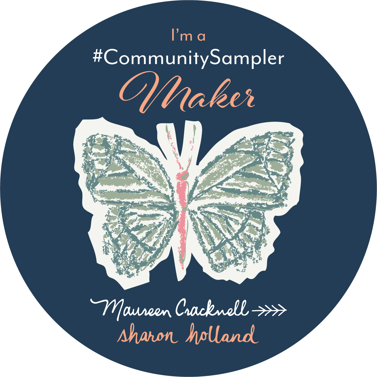
Maureen and I would love to see your fabric pulls and selection process. After reading this blog post, pop over to Maureen's post and see her mood board and fabric pulls for her sampler quilt. If you're on Instagram and use the hashtag #CommunitySampler when posting your sampler photos the entire Community Sampler community can see your work and inspiration. Did you know you can now follow hashtags on Instagram??? Yes, it's a fabulous new tool for not missing a single thing of what you want to connect with on IG. Every time you post to our #CommunitySampler hashtag pool (and have a public account) you're automatically entered into the weekly drawings and every post compounds--furthering your chances to win. This Friday I'll post details about the first giveaway--so start posting away! Don't have anything to post yet? Don't worry. Grab the "I'm a Community Sampler Maker" button below and post that to your IG account. Be sure to use the #CommunitySampler hashtag!

A Word About Copyright

I want to take this time to remind everyone about copyrights and what copyright infringements to avoid. I apologize up front for all the Do's and Don'ts in the following paragraphs. Unfortunately it's a necessary evil to remind everyone to respect the work of others. 

All the graphics, illustrations, photography, instructions, tutorials, logos, etc. posted on this blog and in the PDF downloads are copyrighted materials and are for your personal use only. That means they are not to be distributed in any way whatsoever without written permission by (me) Sharon Holland. Kitting and fabric bundles are allowed but direct your patrons to my website to download the PDFs. Classes are not allowed. Do not post the PDFs on your blog or distribute them. Instead, direct your readers to this site to download the PDFs where they will find the added supportive tips and tutorials from my blog posts. This is a free sew along provided by myself and Maureen Cracknell and our only compensation for the time and money we have put into hosting this event comes from readers finding our blogs. Please remember to give proper credit and direct links when blogging about the sew along. 

If you display your finished quilt in a show or competition, please credit "Sharon Holland" for the quilt design as well as reference the Community Sampler. Of course, the blocks you make are your creation and feel free to post about those--just mention the source and tag Maureen and I. Again, personal use only and not to be used for profit.

The PDFs and posts for this sew along will remain up on my site long after this event ends and all the copyright rules will apply. Thank you for being considerate and respectful of copyrights.

Community Sampler Sponsors

Don't forget that this Friday's a Giveaway Friday on the Community Sampler sew along. Maureen and I will take turns hosting a giveaway each week where one of our generous sponsors will be featured and offering amazing prizes both here on our blogs and also on Instagram. Maureen will be hosting the giveaway from her blog this Friday and you'll be instructed how to enter at that time. Until Friday, happy fabric sourcing!


Tapestry Fabric Collection

Springtime means Quilt Market time! This year the spring Quilt Market will be held in Salt Lake City, Utah. I have never been the SLC and am looking forward to seeing it--I've been told it's beautiful. 

This Market I will be showing my newest fabric collection Tapestry for Art Gallery Fabrics.

Tapestry weaves together an eclectic mix of multicultural-inspired motifs, combining traditional designs with modern graphic brushstrokes in soft, earthy tones.

Summer Garden Colorway

Winter Garden Colorway

I love designing new collections and creating a story around what I am designing. The story helps me keep focused and makes for a more cohesive group of fabrics. I don't like matchy matchy but the prints need to make sense and compliment each other--almost as if one were pulling fabrics from their stash to make a quilt. I like to think my collections have a curated look to them. 

The story for this collection started with the cat print. Catalyst as my print is called made me think of a cat sunning itself on a Persian rug or out in a sunny courtyard. It was as simple as that that started the thought process behind Tapestry. Here are a few behind the scene looks at the inspiration for some of the prints. 


Photo courtesy of Ellen Eichelberger

Photo courtesy of Ellen Eichelberger

Vintage photo of movie star Clara Bow 1920s

Vintage photo of movie star Clara Bow 1920s

The Tracery pattern was inspired by the beach ball in this 1920s photo of Clara Bow. I thought this would be a fun blender type print and the way my pattern turned out as radiating hexagons it reminded me of ripples in a pond.


Vintage African mud cloth

Vintage African mud cloth

I have a fascination with African fabrics and created my Mudcloth print from the various graphic imagery used in African textiles.


Tree of Life on Mata ni Pachedi, printed cloth offering to the mother goddess http://eyeburfi2.tumblr.com/page/16

Tree of Life on Mata ni Pachedi, printed cloth offering to the mother goddess http://eyeburfi2.tumblr.com/page/16

The Tree of Life pattern is used in many cultures and was the perfect motif to add to my garden of prints. I love woodblock printing so my print Eternal was created to simulate the woodblock printing technique. Complete with birds, my print has a light airiness to it and great left whole cloth or cut up in patchwork. 

The print Rosewood was also created to look like a woodblock print and another nod to handcrafted global-inspired artistry. 

Over the next several weeks I will be busy sewing quilts and other samples for my booth. I have two fabulous makers helping me this time. Heidi Staples of Fabric Mutt is making bags for my booth and Alexis Wright of My Sweet Sunshine Studio is making children's clothing from my new collection.  Here's a tiny peek into some of the quilts I have been sewing.

Totem by Sharon Holland Designs

Totem by Sharon Holland Designs

Destination by Sharon Holland Designs

Destination by Sharon Holland Designs

Good news for all of you waiting for me to republish my Orange Peel Table Runner project. I will be remaking the runner with my new Tapestry fabrics and rewriting the instructions to update this super popular free project. This runner was the first pattern I ever wrote and published on this blog when I first started in September of 2010. I cleaned house and pulled many of my old projects because I have changed formats and let's be honest--improved considerably since those first early days! I am hoping next month to have that project available again for free downloading. 

Art Gallery Fabrics has designed some fun graphics to share on your social media feeds. Use Either or both of these "I Want Tapestry" buttons to let your favorite quilt shop know you'd like them to stock the collection in their store! xxxx

Design Process Part 6

Binding 

Binding a quilt is like framing a picture--it is the last layer on your beautiful project. This post will a tutorial about how to make and attach double-fold regular binding and double-fold bias binding. 

Figuring Binding Yardage

Most quilt instructions include yardage and cutting information for the binding. But if they don't or you're creating your own design you will want to know how much fabric to use to finish the edges of your quilt. 

To figure out how much binding is needed first know the total inches around the quilt. Add up the length of all 4 sides of the quilt and add 12" for seams and to have a little extra. Know how wide you'd like your binding to be (before it is folded). Modern binding for quilts is a 2-1/4'' wide strip. This is plenty to double-fold, stitch, fold over to secure to the quilt. Of course you can go wider or narrower if you prefer. My tutorial will be based on 2-1/4'' wide binding.

Once you know your total inches around the quilt plus the 12", divide that number by 42" (for regular double-fold binding). Round the number up to the nearest whole number. The answer will tell you how many 42'' long strips to cut at your determined strip width (2-1/4''). Multiply the number of strips by the strip width for how much yardage is needed to make the binding.

For double-fold bias binding, the number you got for the inches around the quilt plus 12" is the length you want your bias binding once all sewn together. Usually this can be accomplished with a 1/2 yard to 1 yard of fabric depending upon how large the quilt. 

Regular Double-Fold Binding

Regular double-fold binding is the easiest and most common method used in today's quilt patterns. Great for beginners and projects with straight edges.

1. To make the regular double-fold binding, place (2) strips right sides together at right angles. Sew with a diagonal seam. Continue adding strips int he same manner to make 1 long binding strip. Trim seams to 1/4"; press seams open.

2.Fold the strip lengthwise in half with wrong sides together; press.

Starting at the center of 1 edge of the quilt top, place the folded binding on the right side of the top with raw edges aligned. Leaving 12" of the binding strip free, begin stitching with a 1/4" seam allowance. Sew to the corner and backstitch 1/4" from the edge. Remove the quilt from the machine. Fold the strip up at a 45° angle and then back down over itself, lining up the raw edges to make a mitered corner. 

3. Resume stitching, beginning at the tip edge of the new side and continuing around the quilt to the next corner. In the same manner as step 2, sew to the corner and backstitch, remove the quilt from the machine, fold the strip, then continue around the quilt to within 12" of the starting point; backstitch. Remove the quilt from the machine. 

4. Lay the quilt top on a flat surface. Bring the loose ends of the binding together so the binding and the quilt lie flat. Fold the binding ends back onto itself so the folded edges touch but do not overlap; finger press to crease. Open the binding. Place the strips at right angles right sides together using the creases to align the strips as indicated int he diagram by white dashed lines. Pin the ends together as shown. Draw a diagonal line from the corner intersections. Sew on the line. Before trimming the seam allowance, refold the binding and check that it lies flat on the quilt top. Adjust the stitching if needed; check and trim seam allowance to 1/4" when satisfied. Pi the binding down and sew to the remaining edge of the quilt top. 


5. Trim the backing and the batting even with the quilt tip.

6. Turn the binding to the back of the quilt and blind stitch by hand or machine stitch to finish. 

Double-Fold Bias Binding

Bias binding is created when fabric is cut diagonally across the grain at a 45° angle. The stretchy quality of the fabric bias make it perfect to use for binding projects with curved edges. Double-fold bias binding is the most durable of bindings to use on a quilt.

1. Cut off selvages from the fabric. Cut the fabric into a square. For example if your yardage requires 1/2 yard of material for the binding, cut a 18" square to start.

2. Fold the square diagonally in half with edges matching. Press the fold to crease. Open up the fabric. Using the crease as the starting point, draw a straight line diagonally from corner to corner with a pencil and ruler. Working in one direction from the center marked line, draw lines 2-1/4" apart or desired strip width. Repeat on the other side of the center line. Cut strips apart on the drawn lines.

Refer to steps 1 through 6 in Regular Double-Fold Binding using the bias strips for binding. 

To make binding that consists of different prints/fabrics, simply use a variety of strips. Make sure they are all the same width (2-1/4" for example), just use 42" lengths or scrap lengths on hand or left-overs from binding other quilts.


4 Creative Questions

Bonnie Christine of Going Home to Roost, a fellow designer for Art Gallery Fabrics, genuinely sweet and talented person posed 4 creative questions to me on this creative blog hop: 1) What am I working on? 2) How does my work differ from others of its genre? 3) Why do I write/create what I do? 4) How does my creative process work?

Here are my answers

Q: What am I working on?

A: Even though I am the sort of designer that needs to be very focused and work on one thing at a time to really get into it fully, I don't have that luxury right now and have several things going at once. The quilts and projects I made for Quilt Market need to be written and illustrated for patterns and my plan is by year's end to have those designs as PDF patterns for purchase. This site has been known for it's free patterns but it is time to take it to the next level and start making some money from my experience and creativity. 

I am also excited to say I am designing prints for my next collection with Art Gallery Fabrics. I can't say much about it now but am focused on further defining my style as an artist and branding my particular look for pattern design--so more of what you know and love about my designs!

My first Art Gallery Fabrics collection Gossamer will hit the stores in December. I want to be sewing new quilts and projects with my prints as soon as the fabrics are in--can't wait to start sewing new stuff with the yardage so I need to be planning out what I want to make. 

Q: How does my work differ from others of its genre?

A: Hmm, that is a tough question to answer. I love all the variety of design styles available in fabric today. It would be boring if we were all the same--right? So having a signature look and style is so important to differentiate your look from the rest.

I know my designs have a particular look to them but I am not sure I can be the one to describe it. As an Art and Design major, I love to see the artists hand in the work. I am attracted to simple, clean design--not fussy or too many colors. I really try not to look at what other current designers are doing so as not to be influenced. It is too easy to be derailed but seeing everything that is going on out there. Instead I look at works of textile and fine art artists from the 20th century. I am fascinated with mid-century design with the skeletal lines and geometric quality to objects. I am sure my work will evolve as I make more collections but this is my direction right now.

Q: Why do I write/create what I do?

A: I love fabric because you can make useful things with it. I love pattern. Becoming a textile designer was the perfect outlet to make beautiful designs that could be made into cloth and then sewn with. What a perfect circle! If I wasn't a textile designer I would be doing something creative like painting landscapes, drawing, graphic design, photography, crafting, etc. I have this uncontrollable NEED to create! To make something that lasts. 

Pine Copse by Sharon Holland

Q: How does my creative process work?

A: Like many other designers I have an idea or story in my head before I can get started designing. This helps to keep my focused and helps to define the types of prints I will want to make for a collection. I don't always have a name for the collection right up front but a vision and mood for it. I start collecting ideas. I do an initial gathering of images, ideas, colors, references from my personal library of art books, photos, internet and from previous designs I have made just to immerse myself in the idea I have come up with. But I don't make mood boards or even write anything down. I keep my vision in my head and constantly reshape it and sculpt it as I design.

As I go along the vision either gets clearer or falls apart--I can't say there is always success. Ideas morph and change as I go along. Getting 10 prints to play well together is like a house of cards and sometimes you have to do some rebuilding to get it all right. It is a process for sure and I love it. I discover a lot about myself each time I do a collection and love to push my brain into thinking about things differently and from a new angle. 

I find that I can do some of my best brain work laying in bed. There is no light to see and get distracted by anything and I can be creative without constraints of paper, pencil or computer. I do keep a tablet, pen, and flashlight by my bedside for those (sometimes) brilliant ideas. When I am working at my computer and get stuck on a pattern and it is not working to my liking I usually step away and take my dog Henry for a walk. Being outside and away from my desk helps me think clearer and usually by the time I am back I have mentally worked out all the issues and everything comes out beautifully! So, most of my creative process is done in my head.

Who’s Next?!

though it’s not mandatory, i would love to hear these questions answered by Bari J., Maureen Cracknell and April Rhodes. if you'd like to join in, please do so! just answer these questions and tag a few other creatives to join the fun. be sure to leave a link to your post in the comments section here so we can join along!